![]()
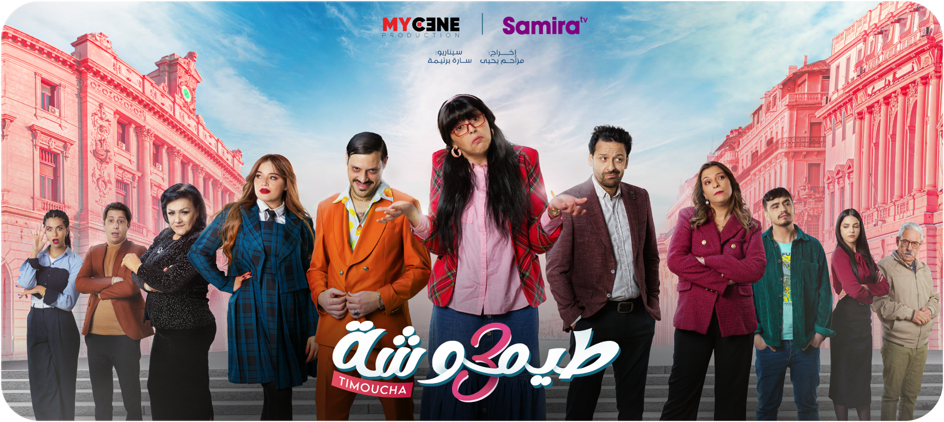
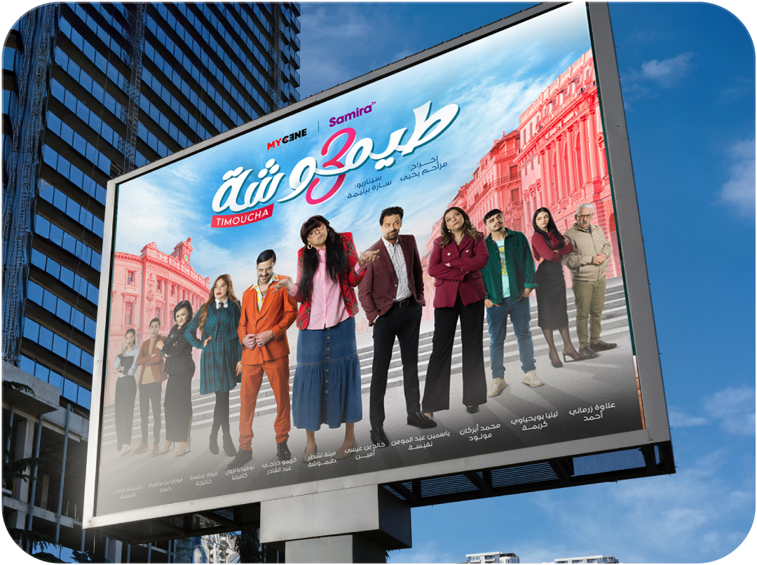
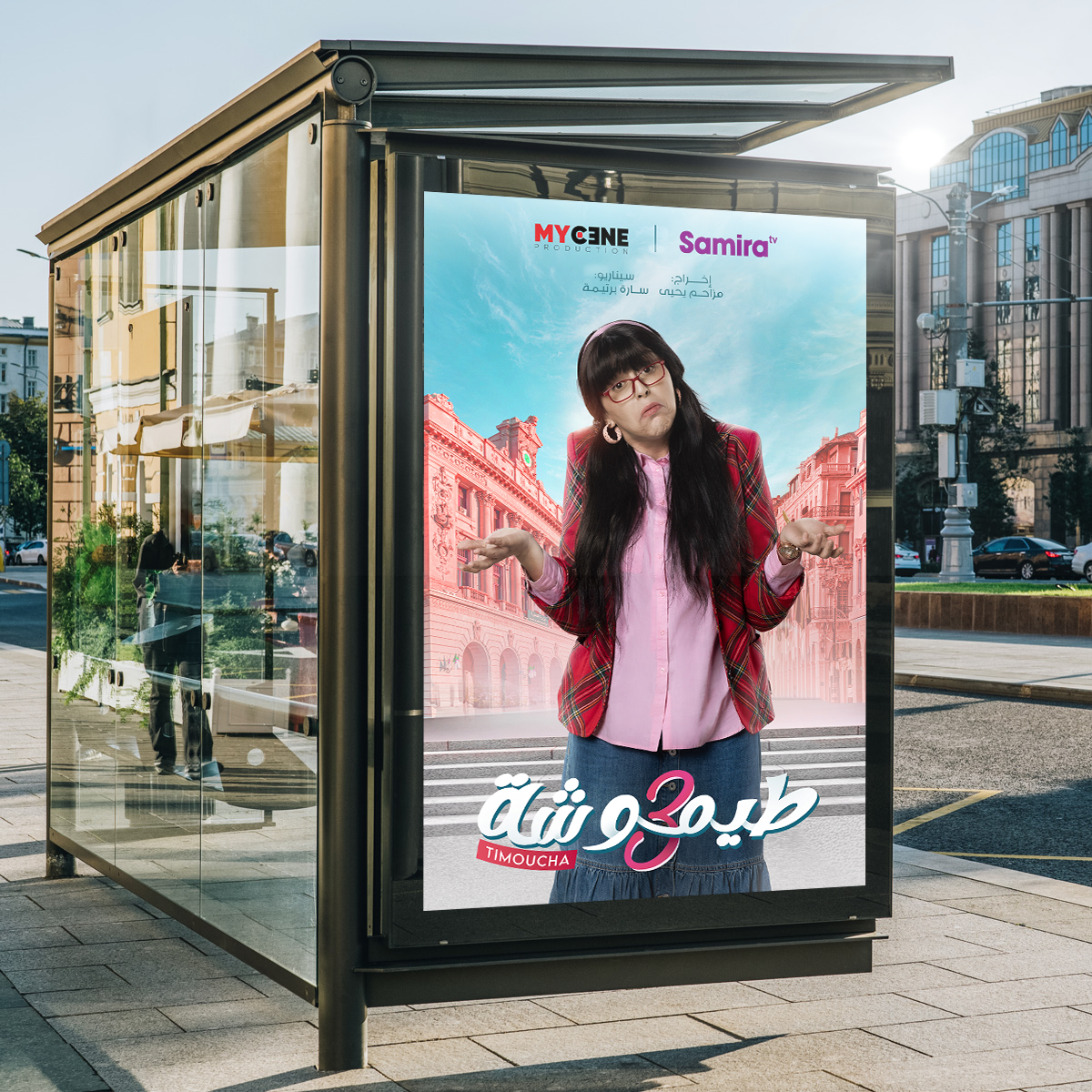
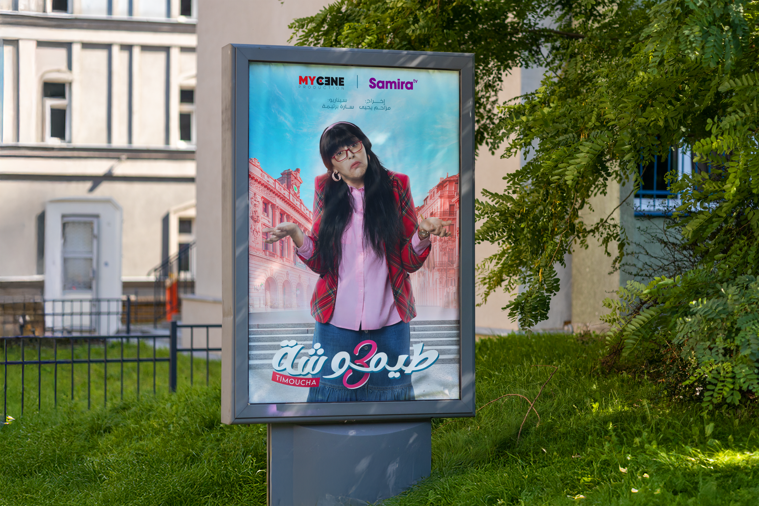
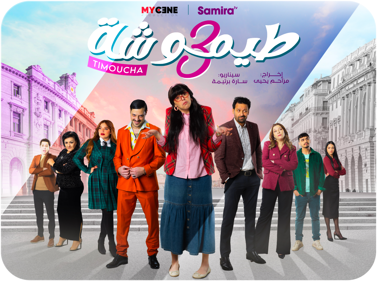
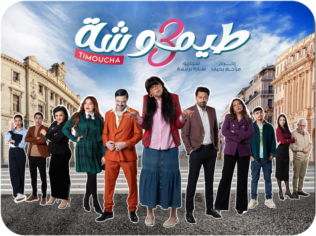
KEY VISUAL
Designing the main poster used for advertising campaigns (urban display,digital use)
Genre: Comedy | Channel: SAMIRA TV | Agency: RED M
My Role: Art Style, Key Visual Design, Photo Compositing, Color Direction
Challenge
The main challenge was to visually communicate “new season, same beloved characters with more energy”. The key visual had to:
– Clearly signal a fresh season without alienating the existing audience.
– Represent Algeria as a recognizable and emotional setting.
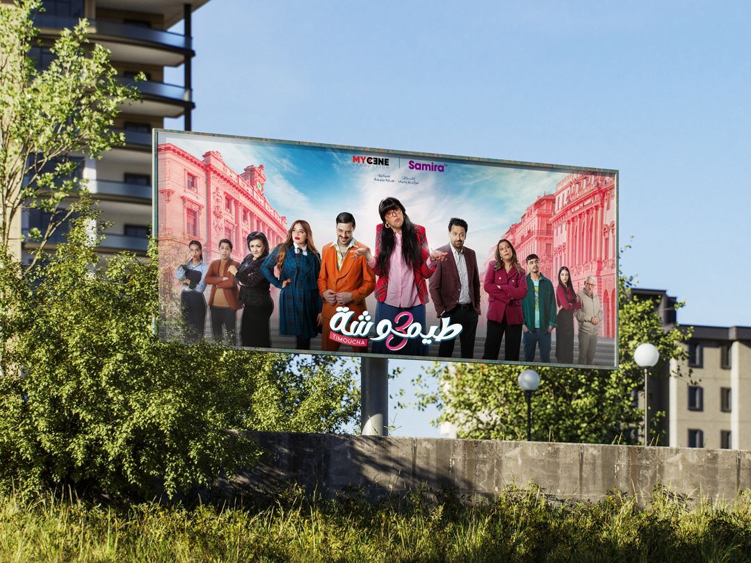
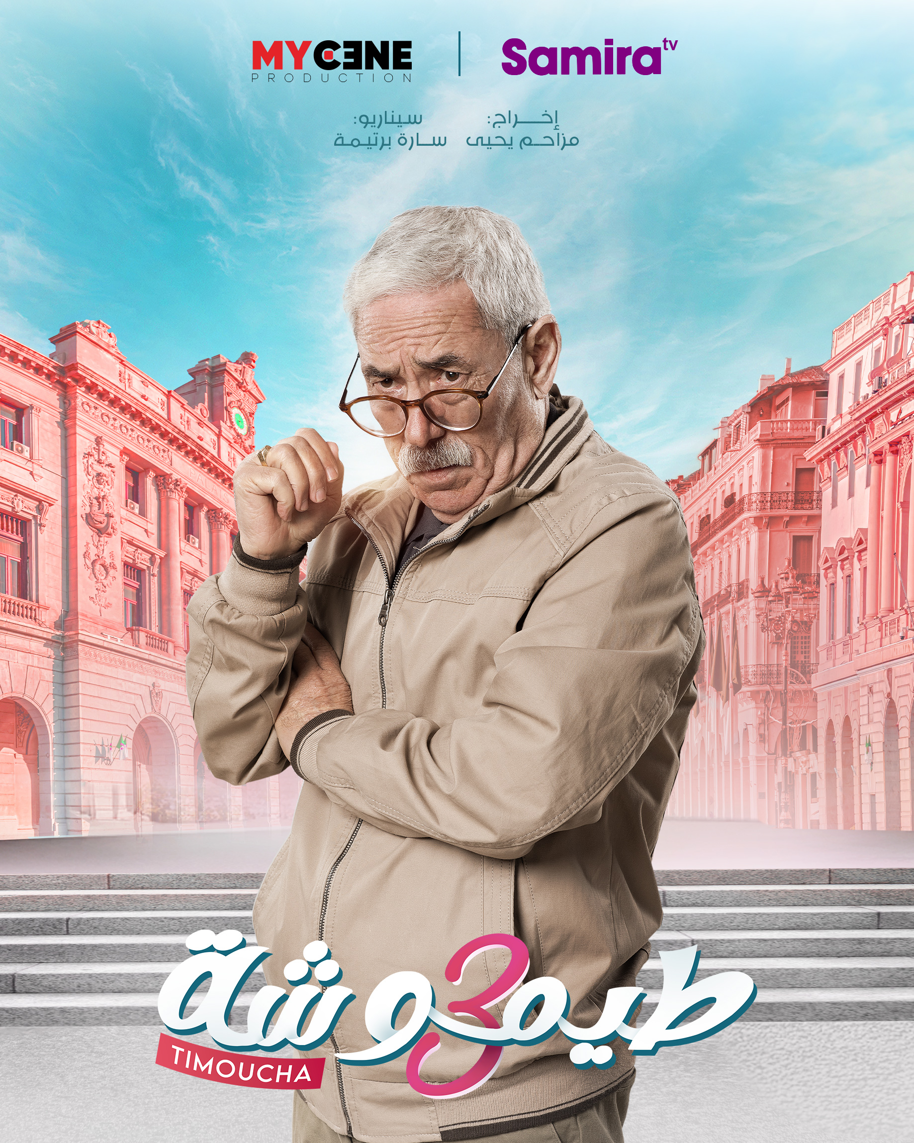
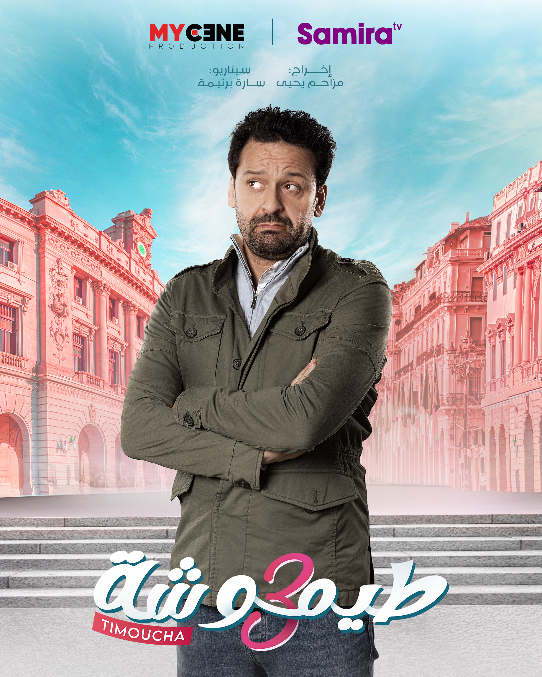
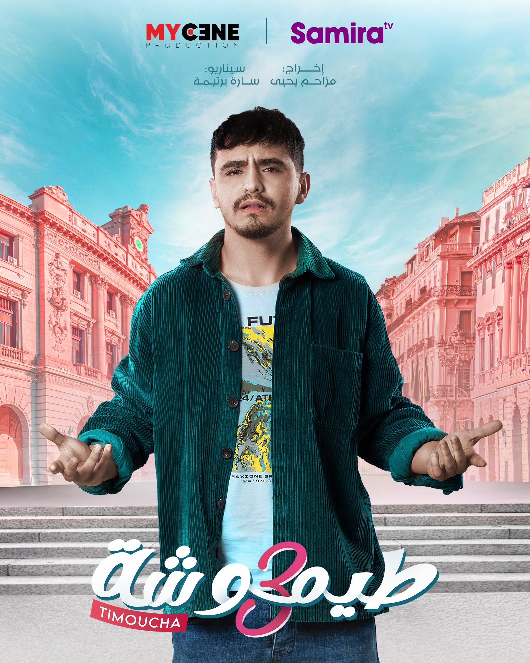
– Balance a large ensemble cast while keeping a strong central focus.
– Feel colorful, modern, and cinematic, yet accessible to a broad TV audience.
– Work efficiently across multiple formats and scales (digital, OOH, and print).
STRATEGY
The visual strategy focused on three core pillars:
1 – Upbeat & Colorful Tone
A vibrant color palette and warm lighting were used to immediately communicate comedy, optimism, and entertainment value.
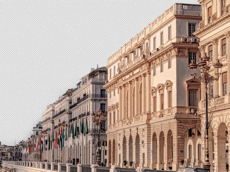
2 – Strong Sense of Place
Algiers’ architecture was integrated as a stylized backdrop, grounding the series culturally and emotionally while giving the visual a strong local identity.
3 – Clear New-Season Signal
Through refreshed styling, dynamic composition, and contemporary color grading, the visual unmistakably positions the show as renewed, current, and relevant.
CONCEPT
The concept centers on character-driven energy within a stylized urban stage.
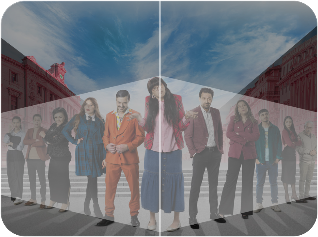
– The ensemble cast is arranged in a semi-symmetrical composition, creating balance while allowing each character’s personality to read clearly.
– The central character anchors the composition, acting as the emotional and comedic focal point.
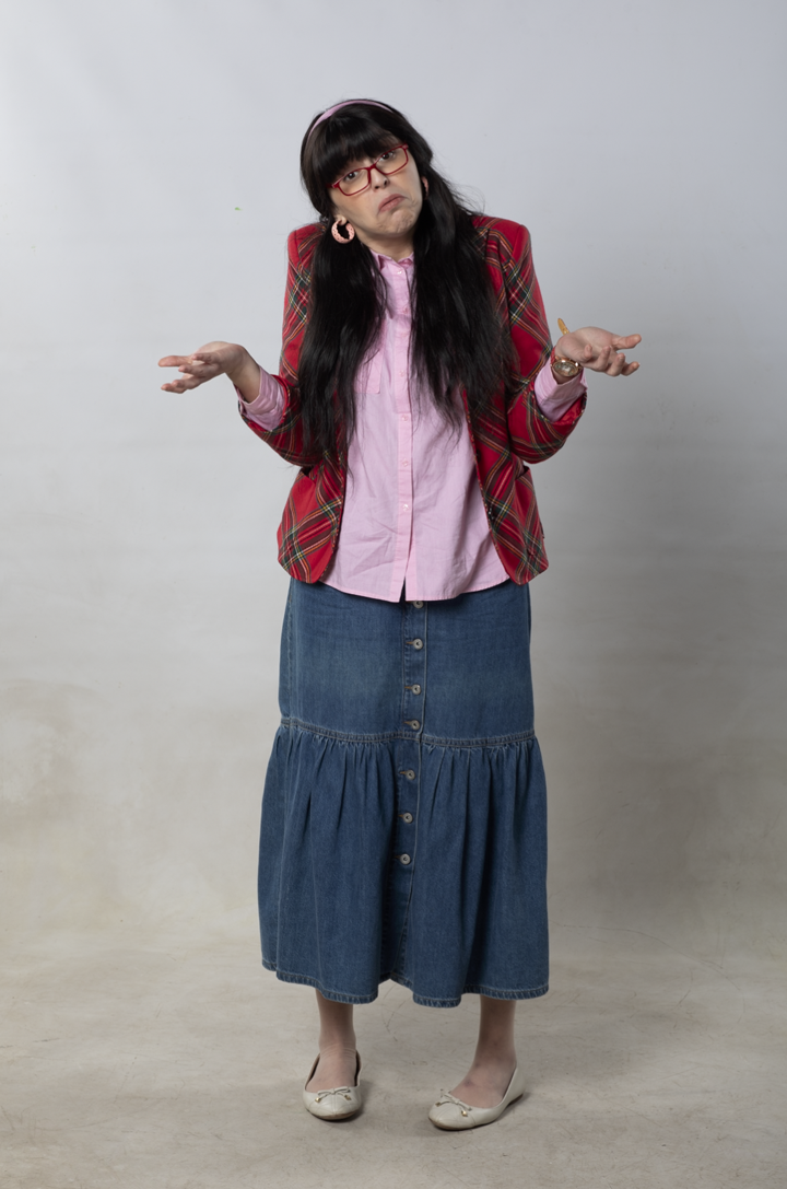
– A mix of realism and stylized color treatment creates a cinematic look that feels polished but still playful.
– The background architecture is intentionally softened and color-treated to enhance depth while keeping full attention on the characters.
Visual
Direction
Color Palette: Bold reds, warm neutrals, and fresh sky blues to enhance contrast and vibrancy.
Lighting: Soft, warm lighting on characters to create approachability and visual harmony.
Styling: Wardrobe choices emphasize personality, humor, and diversity within the cast.
Composition: Carefully balanced spacing ensures readability at both large (billboards) and small (mobile screens) scales.
Typography Integration: The title treatment complements the playful tone while remaining legible and iconic.
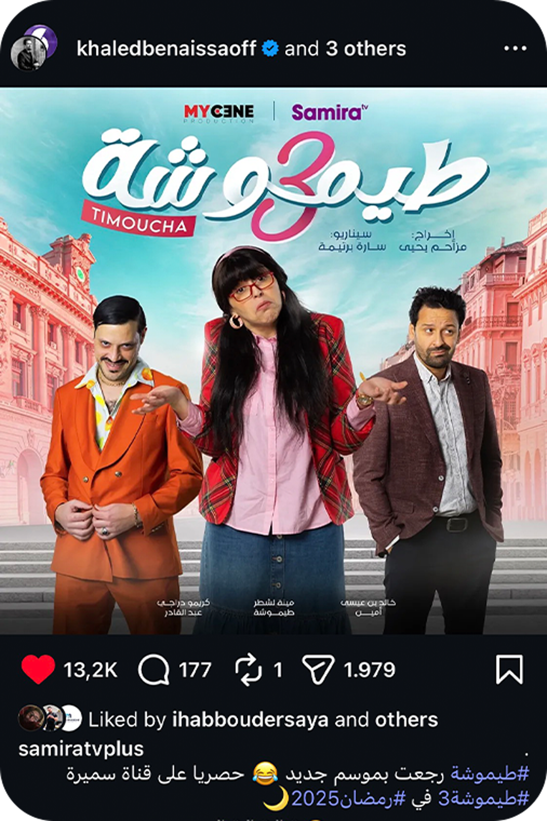
IMPACT
The key visual successfully re-launched the new season with strong visual energy.
It was widely used across social media, broadcast promotions, and outdoor advertising.
The artwork contributed to high audience engagement and strong online traction.
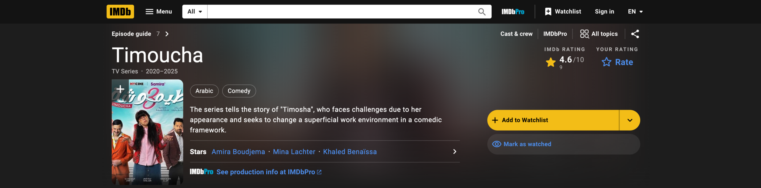
The series and its official visuals were listed on the official IMDb website, reinforcing the project’s professional and international visibility.
The visual became a recognizable identifier for the season, strengthening the show’s brand presence.