![]()
BRANDING
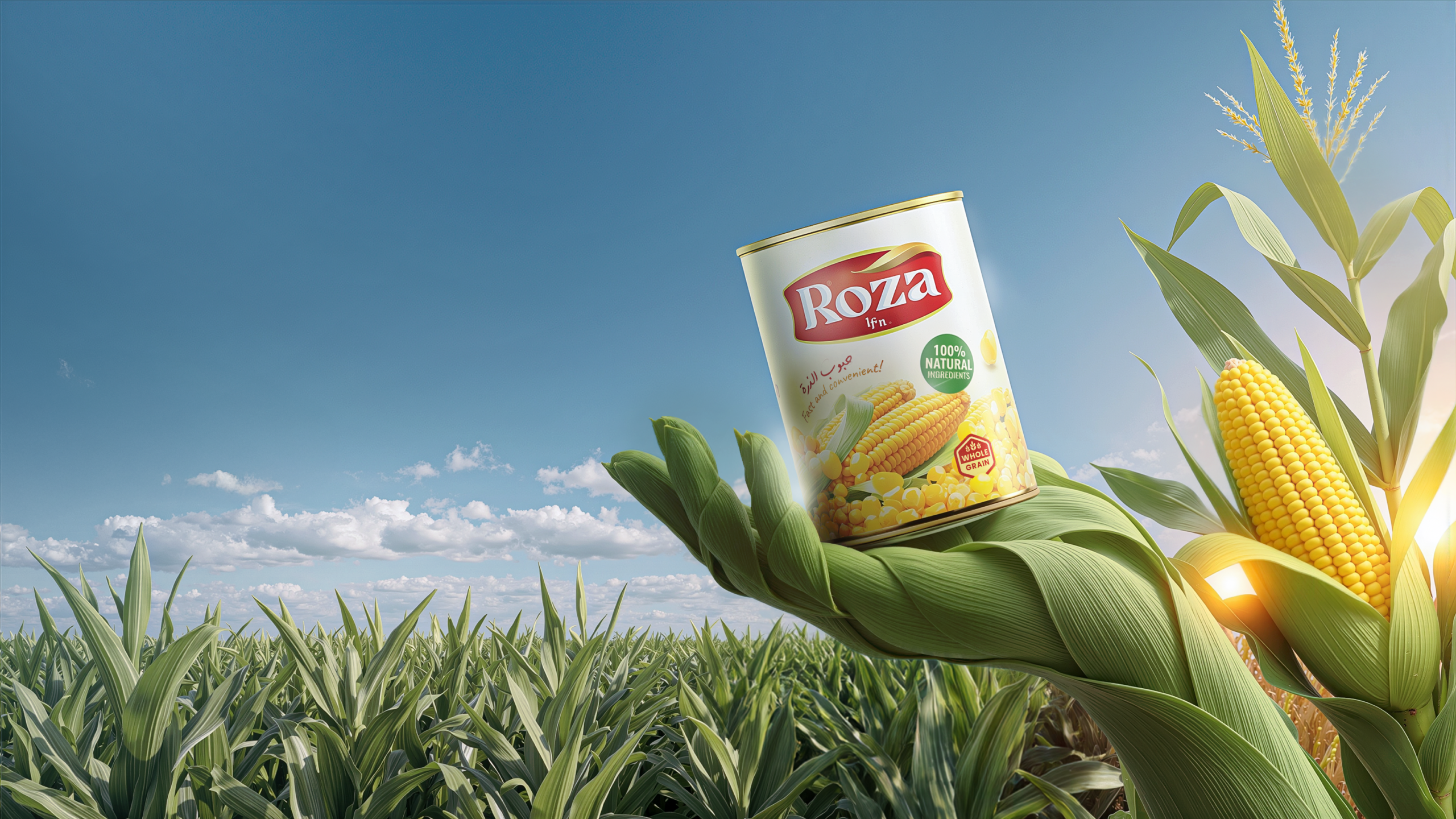
Roza is a food brand specializing in canned corn and natural nutrition products. The brand embodies freshness, authenticity and trust. Values rooted in its direct connection to the land.
Brand Identity Design, Visual System Development
| Agency: RED M |
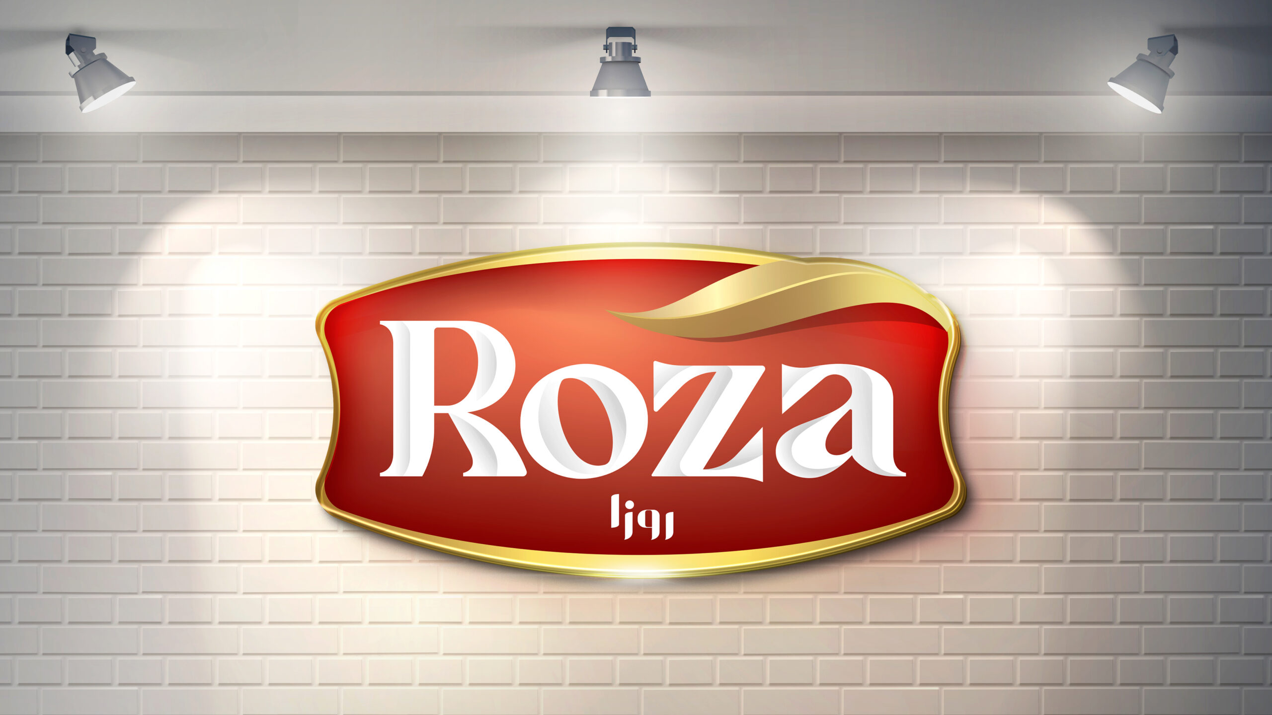
concept
it has to be recognized
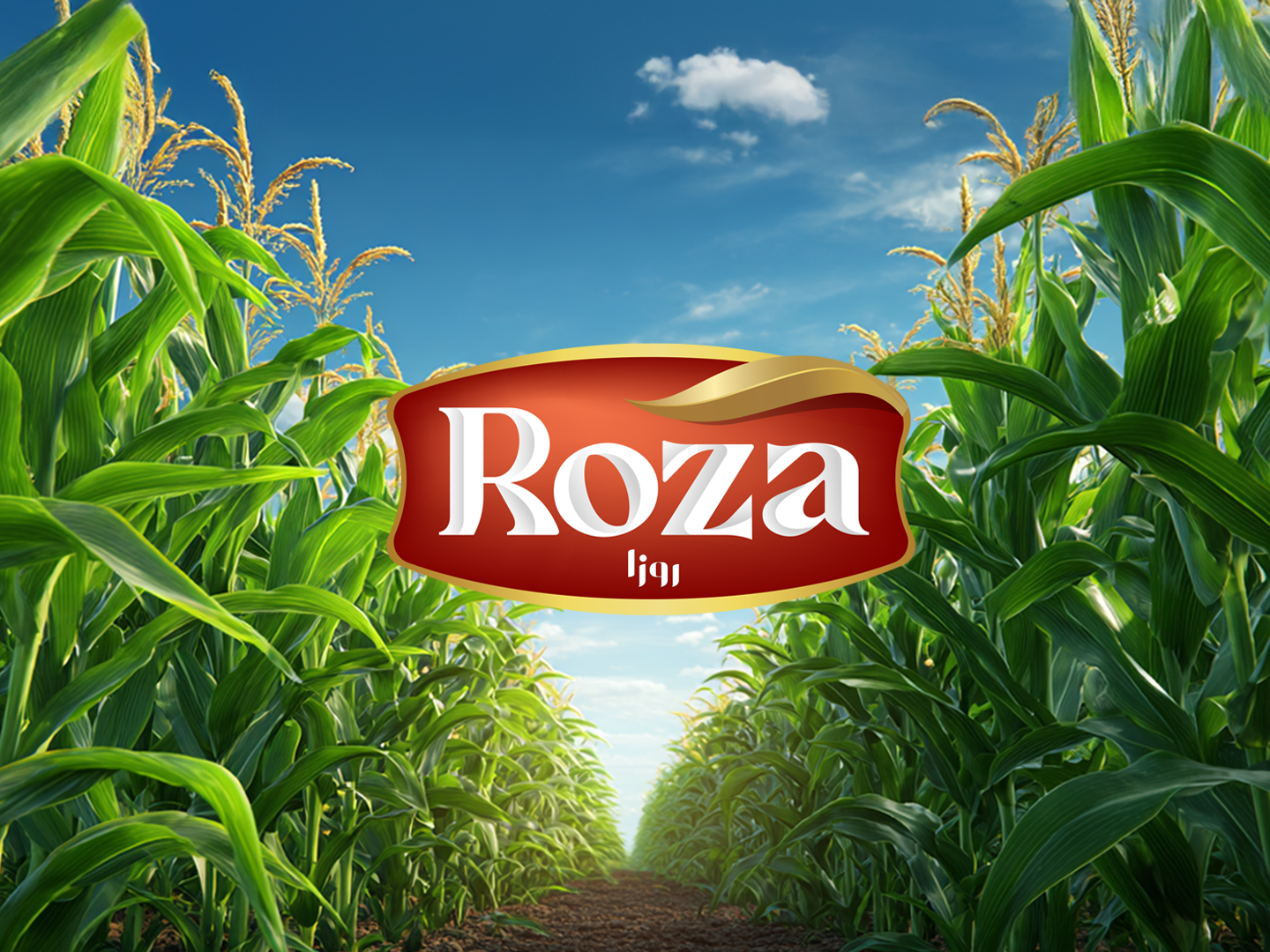
The visual identity draws inspiration from the agricultural fields . The logo’s curved form evokes the shape of a can label, while the gold accent represents the quality. The deep red tone conveys warmth, appetite.
The brand system was dev eloped to adapt seamlessly across packaging, digital, and promotional materials.
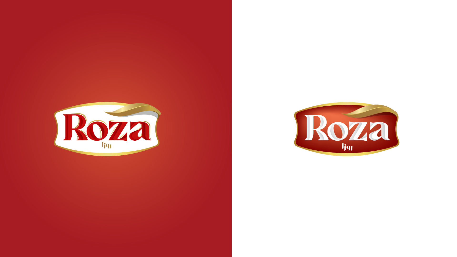
Logo Logic
Deep red tones evoke warmth, richness, and appetite appeal
Gold detailing reflects quality, care, and a premium touch
Classic serif typography reinforces trust, heritage, and stability
Brand Message: Natural goodness you can trust—bringing the purity of the land into everyday meals
Target Perception: Fresh and natural
Honest and reliable
Rooted in tradition yet suitable for modern lifestyles.