


Branding
Algerian Equestrian Federation
A contemporary identity for one of Algeria’s most historic and noble sports.
The idea
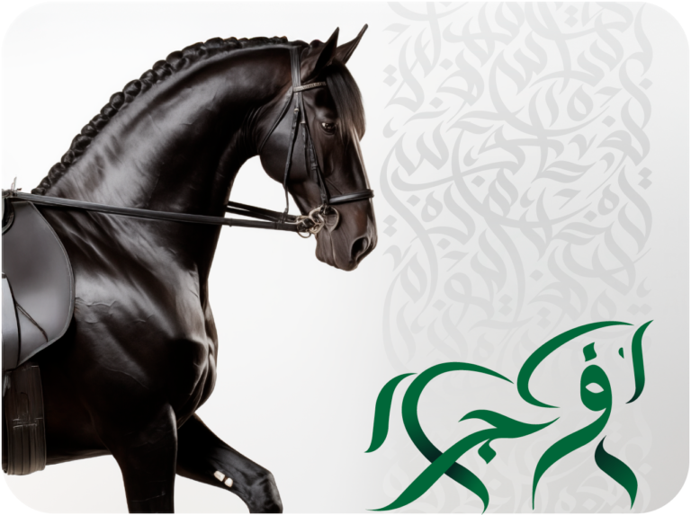
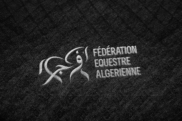
More than a shape: a horse at a trot, strength present but mastered, drawn with fluid lines inspired by Arabic calligraphy.
Client
The Federation
Sector
Sport
With
RED M
Scope
Brand identity
Tone
Elegance over excess · Discipline over aggression · Heritage without nostalgia
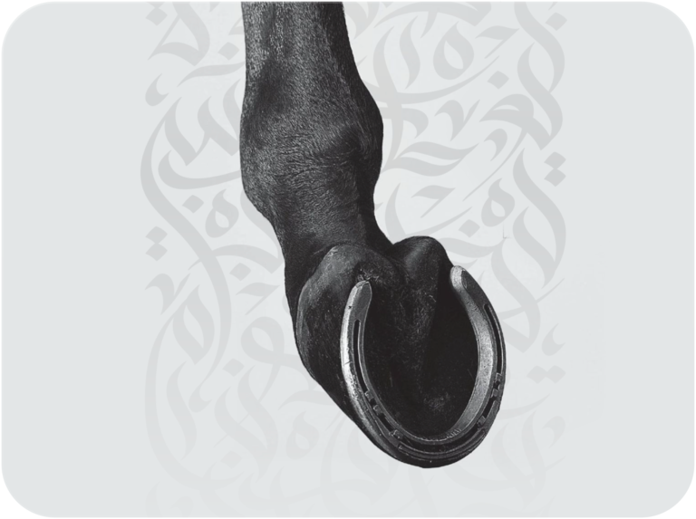
The mark & visual system

Gear & details
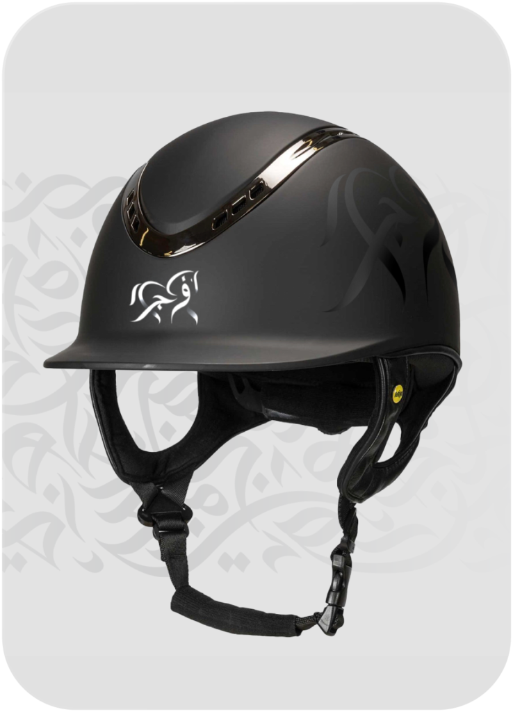

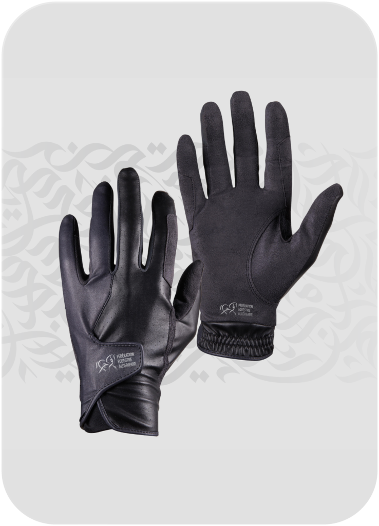
In the field




Print & merchandise



01
Brief
Redefine the federation’s identity through a contemporary lens while keeping its cultural depth, symbolism and institutional authority.
02
Challenge
Be emotional enough to inspire pride, and precise enough to represent a national institution.
03
Strategy
A trotting horse drawn in Arabic calligraphic lines that spell the federation’s name, a custom calligraphic pattern, and restrained colour and typography.