![]()
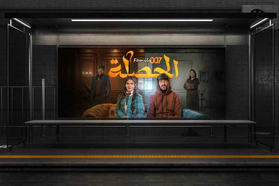
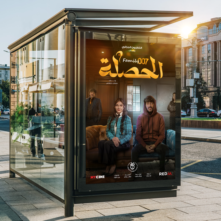
KEY VISUAL
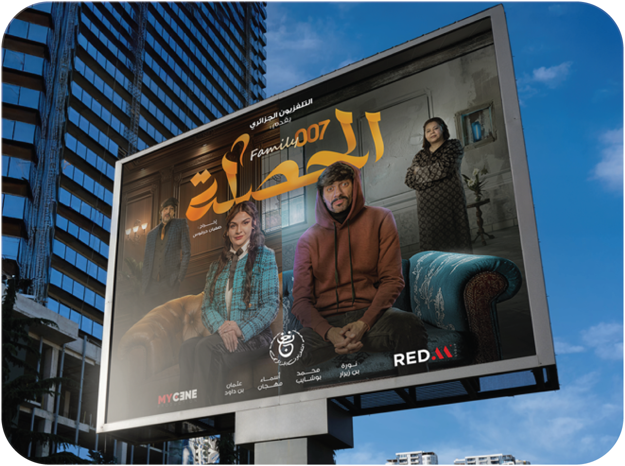
Designing the main poster used for advertising campaigns (urban display,digital use)
Genre: Romance, Comedy | Channel: ENTV | Agency: RED M
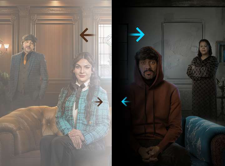
The goal was to introduce the main characters with a contrast between two worlds: a sophisticated upper class environment and a humble, humorous family setting.
STRATEGY
The client requested a visual that represents the core personality of the show :
– Comedy and family tension
– Opposites attract (rich world vs simple world)
– Strong characters with clear personalities
– A warm Ramadan mood without making it cliché
The goal was to design a visual that instantly communicates the show’s tone and light, romantic, and relatable while standing out in ENTV’s seasonal lineup
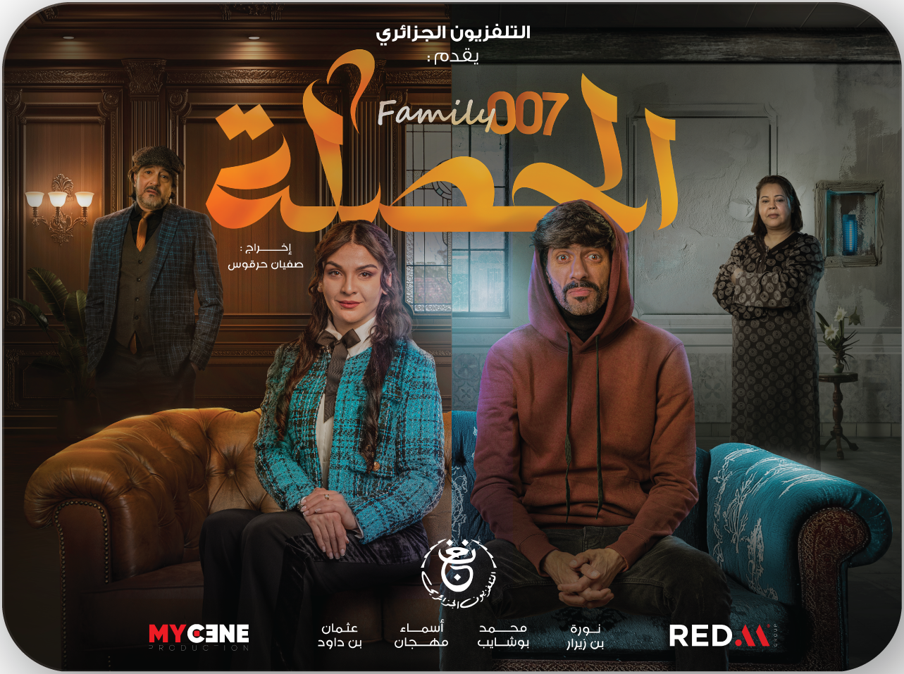
CONCEPT
A composition plays on contrast: closeness vs. distance, love vs. stubbornness. the kind of chemistry that drives the series. all that in a visual identity that combines modern typography with playful color accents to reflect the show’s youthful, feel-good energy.
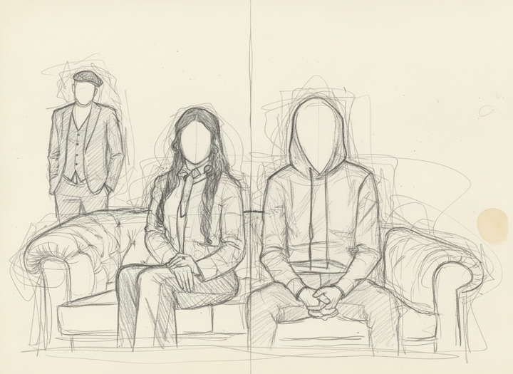
The creative idea was to divide the frame into two parallel universes:
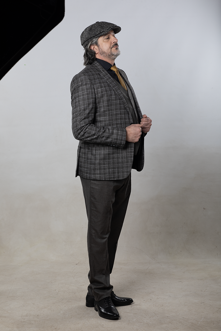
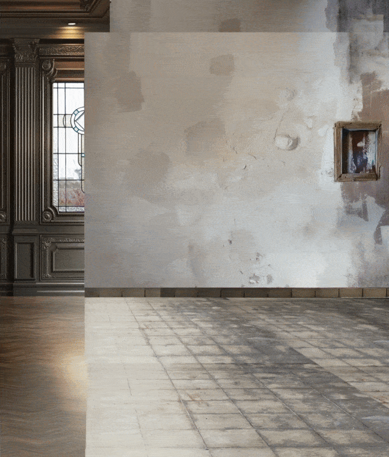
Left side: an elegant, warm, high class Moroccan wooden interior.
Right side: a colder, modest home reflecting everyday Algerian life.
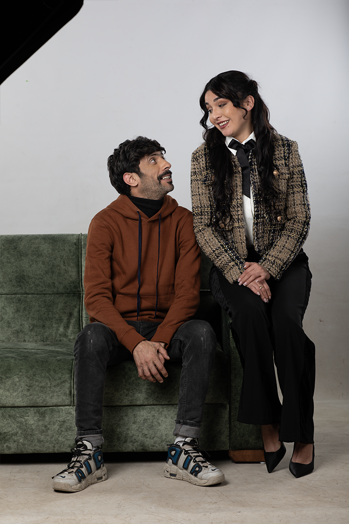
Both sides meet naturally through the two main characters sitting in the center, highlighting their relationship dynamic.
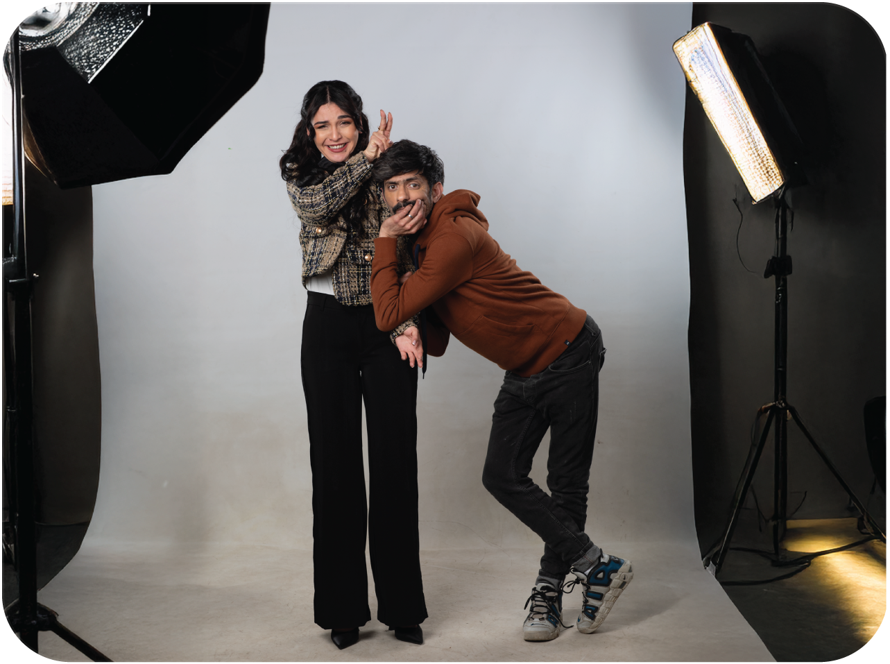
Character
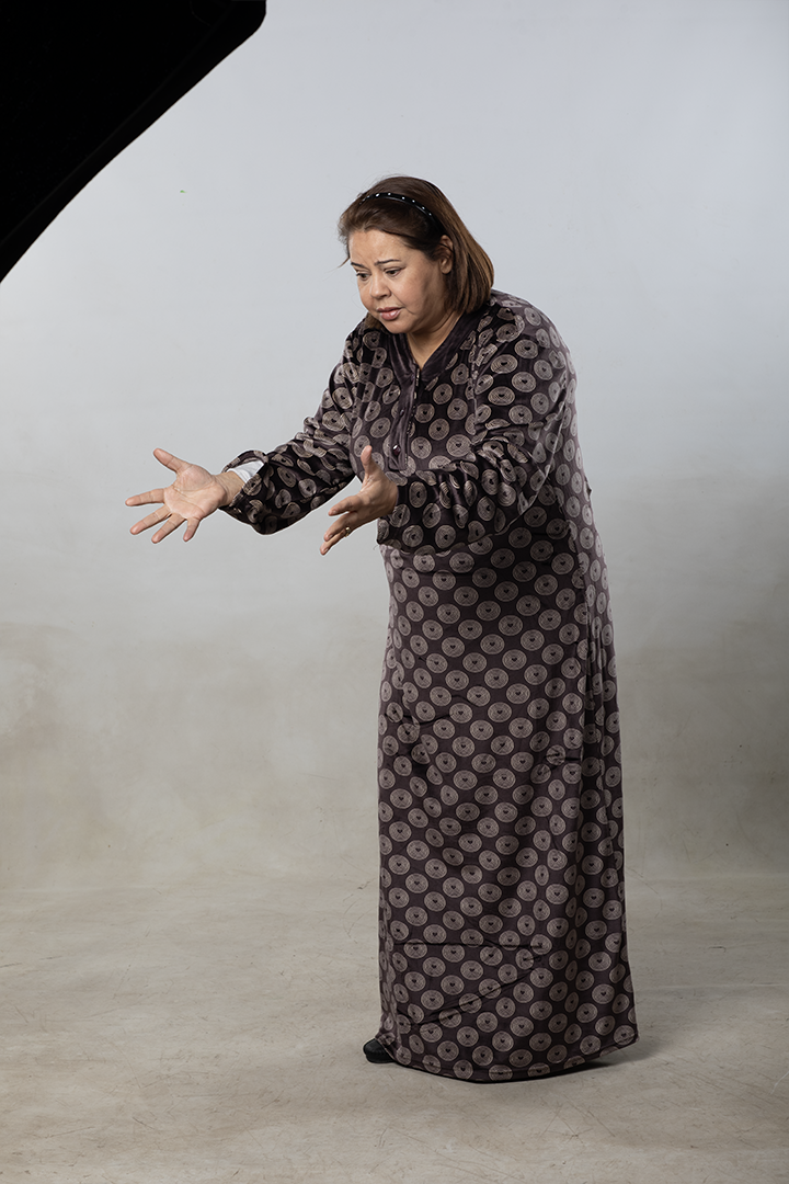
Each character was styled and positioned intentionally :
– The lead female character appears confident and elegant.
– The male protagonist sits casually with a slightly confused comedic expression.
Supporting characters in the background symbolize family tension and the two different lifestyles.
The poses, styling, and micro-expressions help communicate the humor and story without dialogue.
Design & Composition
The environment was built using multiple photo elements, staged furniture, and texture work.
The split-scene design was matched using perspective correction, texture blending, and consistent atmospheric depth.
Typography & Branding
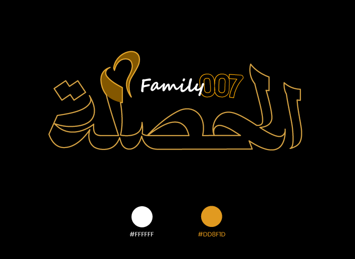
The title “الحصلة” was custom-drawn with soft, expressive Arabic letterforms to reflect the show’s warm comedic tone.
The small heart shape inside the lettering represents the family bonds and light romantic energy of the series.
A warm orange gradient gives the title a cozy Ramadan feel and strong contrast against the background.
The English subtitle “Family 007” adds a modern, playful identity that supports the series’ humor and character dynamics.
IMPACT
It may helped position El Hasla at the first impression by making it appear as one of ENTV’s standout unique Ramadan shows fresh, charming, and true to its story’s heart.