![]()
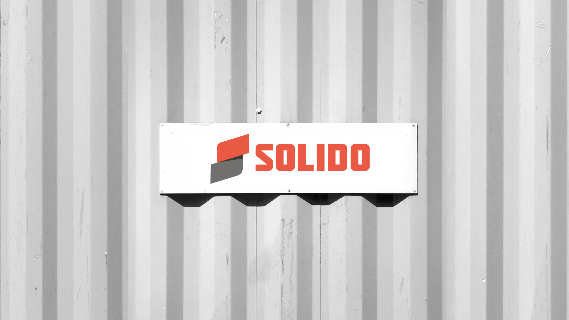
BRANDING
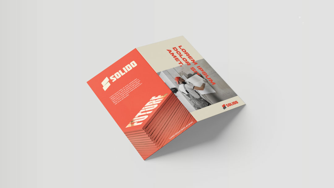
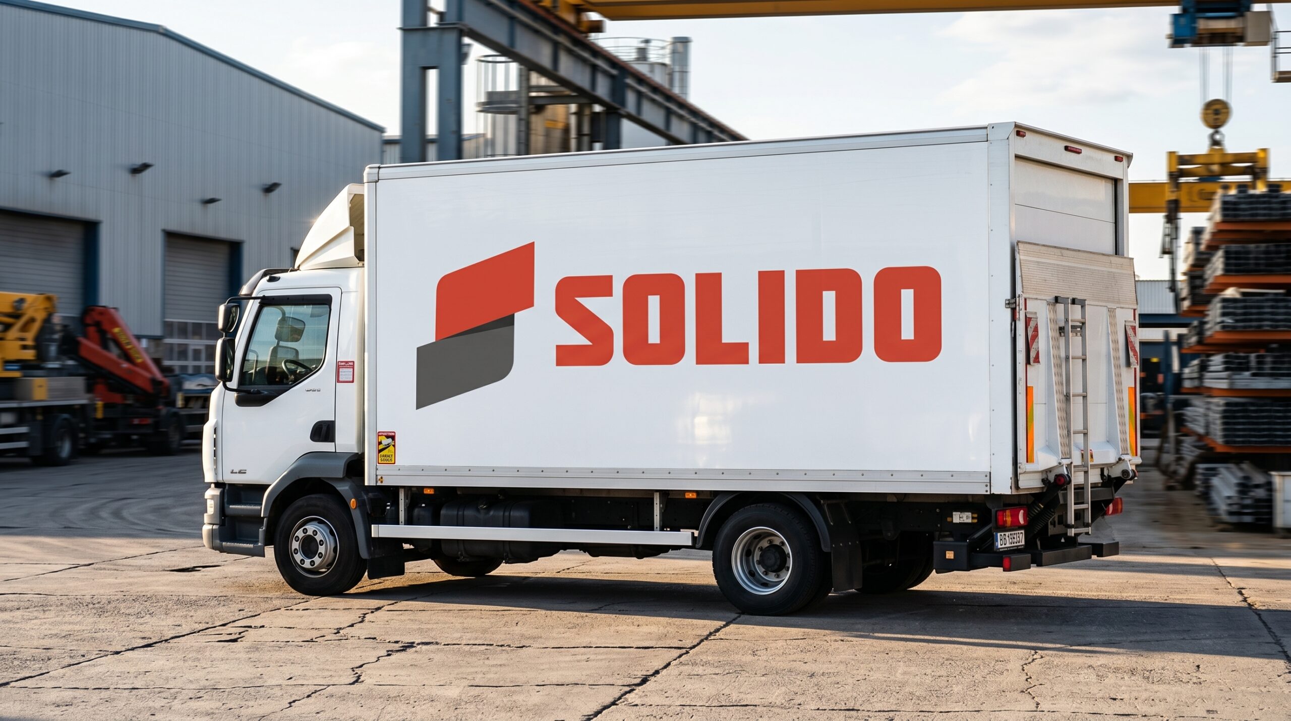
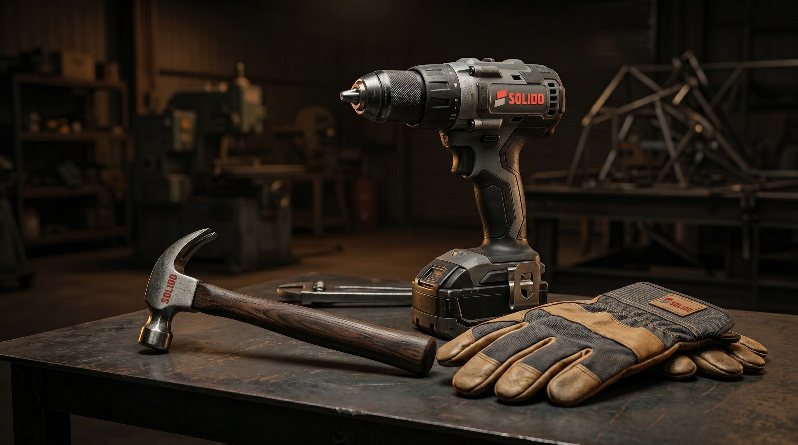
SOLIDO is a brand positioned in the construction and finishing materials industry, specializing in plaster and structural surface solutions. The identity is built around the core idea of strength, precision, and reliability
Brand Identity Design, Visual System Development
| Agency: RED M |
Challenge
it has to be clear and memorable
The goal was to create a visual identity that:
– Communicates durability and trust
– Feels modern and industrial, not outdated
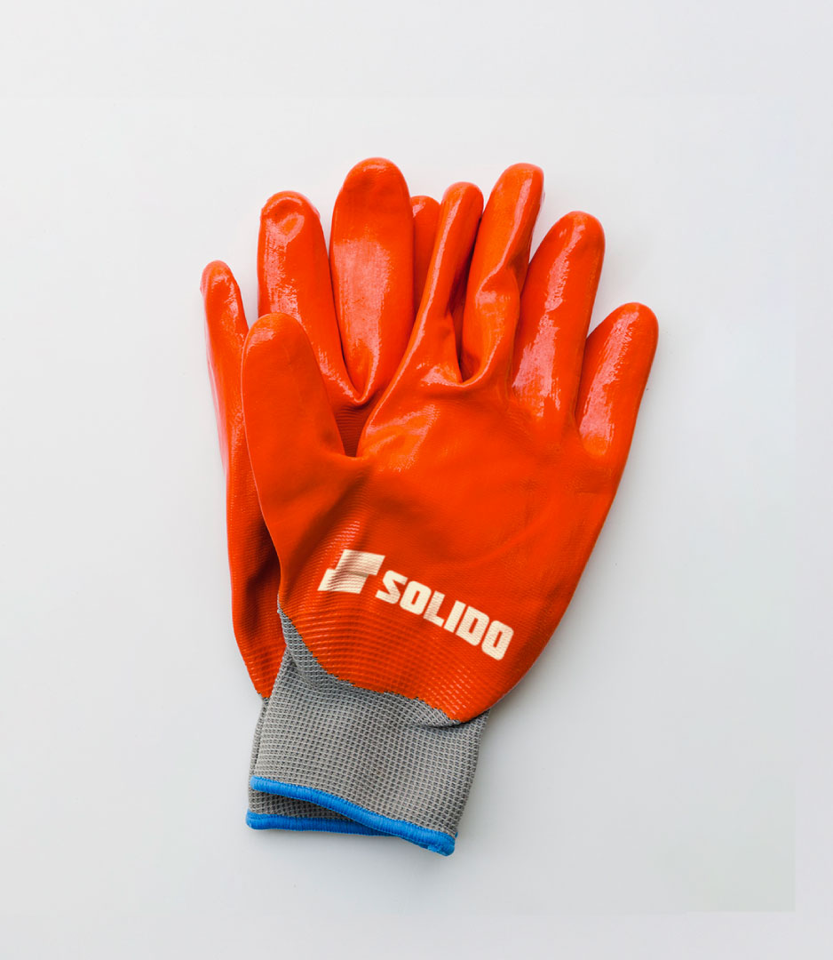
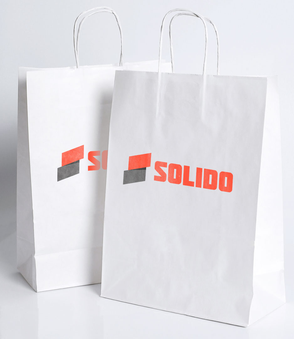
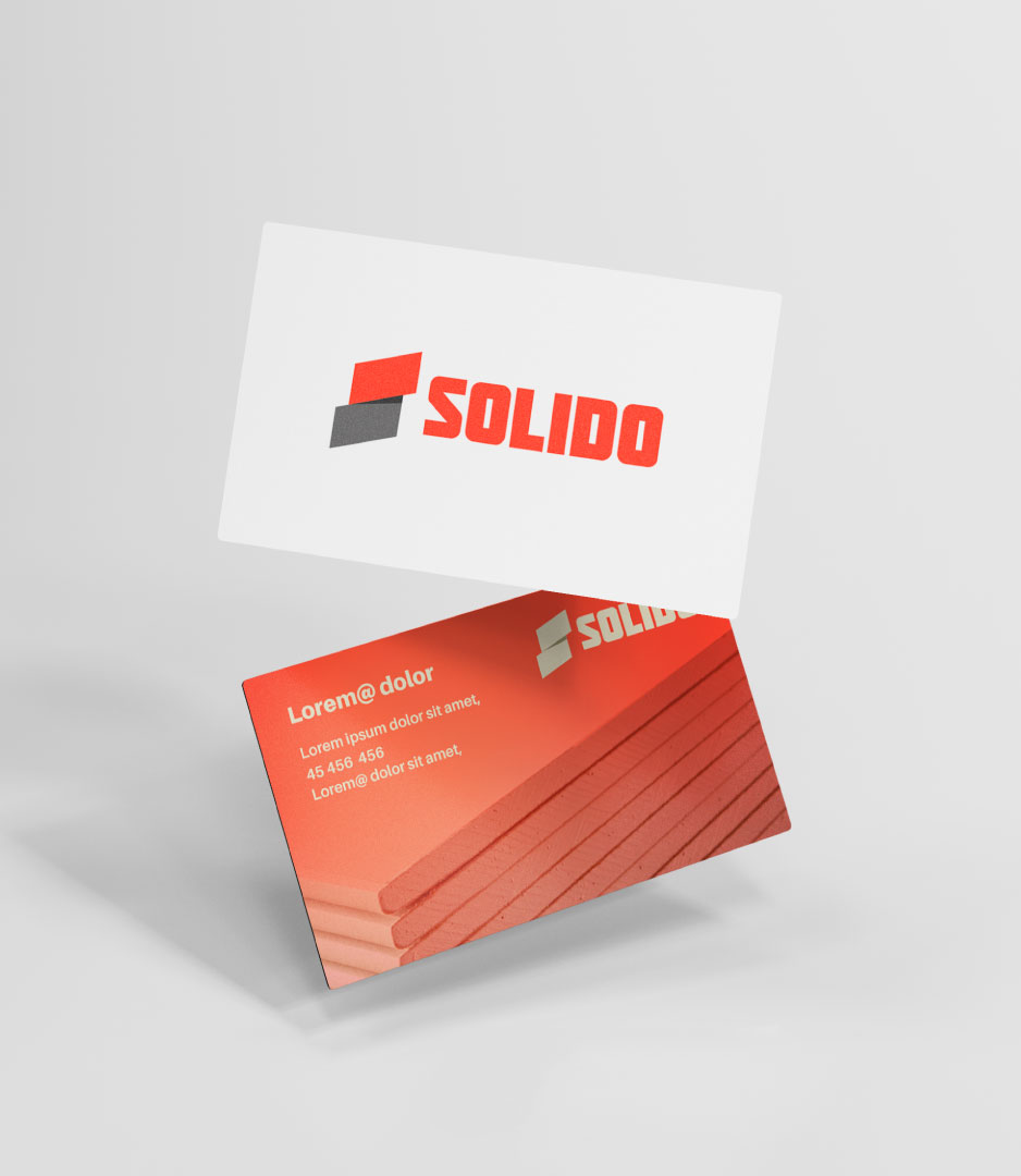
– Works seamlessly across real-world applications (safety gear, print, packaging)
– Stands out in a market often dominated by generic construction branding
CONCEPT
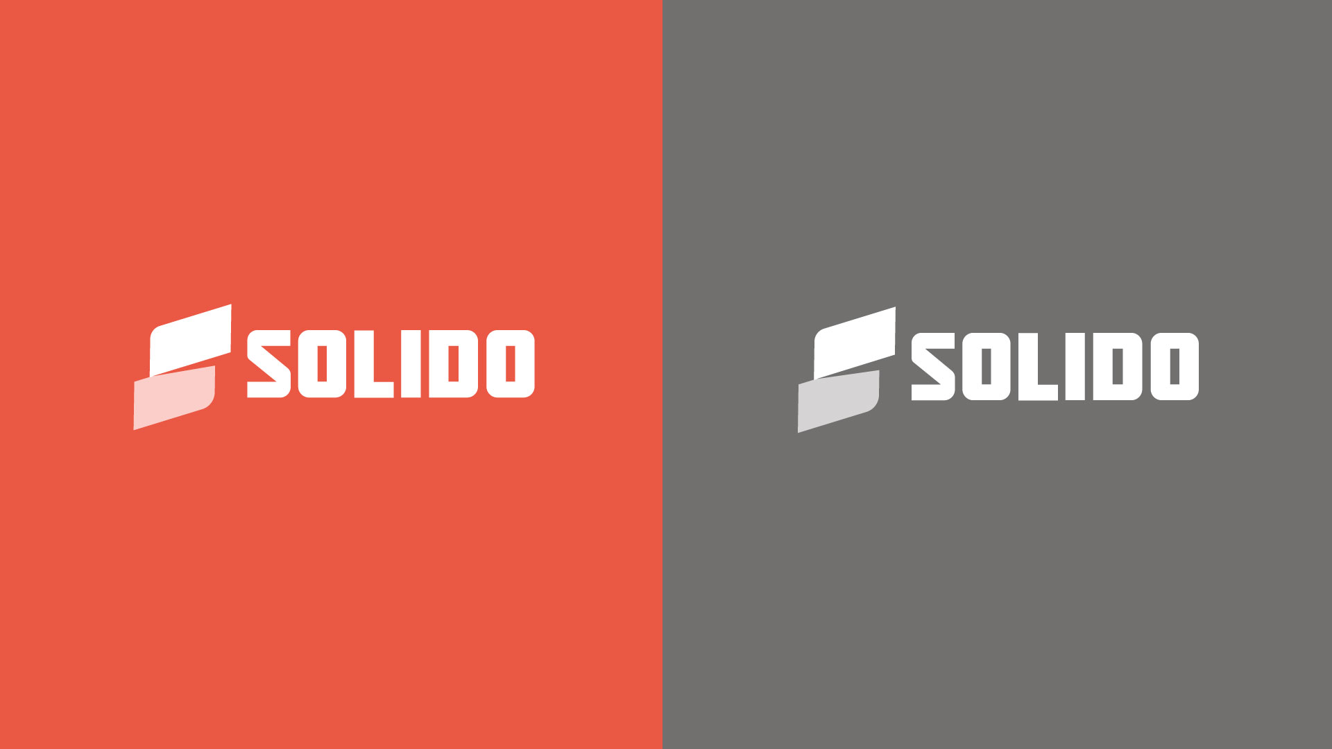
The concept revolves around material solidity and architectural geometry.
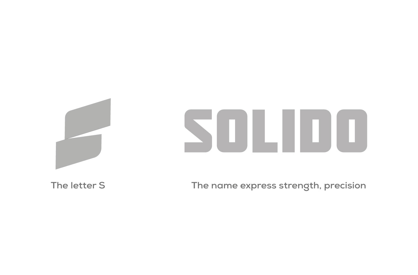
The logo symbol is derived from:
– Layered construction elements (plaster layers, slabs, panels)
– A stylized “S” form, subtly embedded within geometric blocks
– Angled shapes that suggest structure, assembly, and precision
This creates a mark that feels:
– Engineered rather than decorative
– Functional yet distinctive
– Strong without being overly complex
Typography : a bold, modular sans-serif style:
– Heavy weight → communicates strength and stability
– Clean cuts → reflect precision and professionalism
– Compact structure → reinforces a solid, grounded presence